Power ranking the current alternate uniforms in Colorado pro sports
May 27, 2022, 1:06 PM | Updated: May 29, 2022, 4:10 pm
Friday, the Rockies added to the growing and dizzying array of alternate uniforms worn by Colorado teams by unveiling their City Connect jerseys.
Are they a home run? A grounder to second that results in an inning-ending 6-4-3?
Well, they’re not at the top of this ranking of the current alternate uniforms by Colorado pro teams.
(Key word: “current.” Thus, the Avalanche’s “Reverse Retro” attempted tribute to its Quebec Nordiques doesn’t make it into this ranking, since the Avs didn’t wear it this season.)
Let’s go:
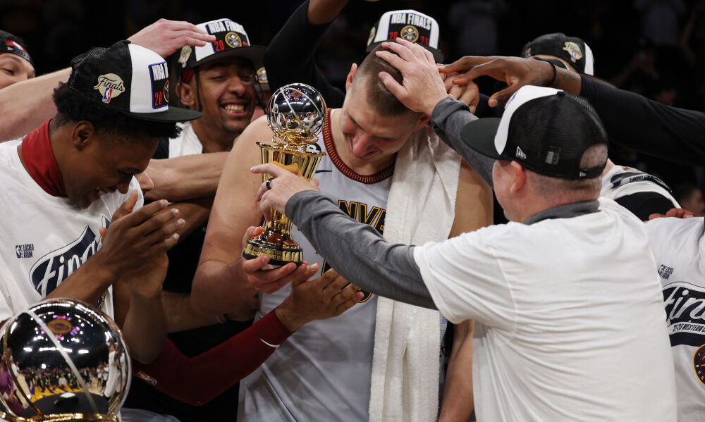
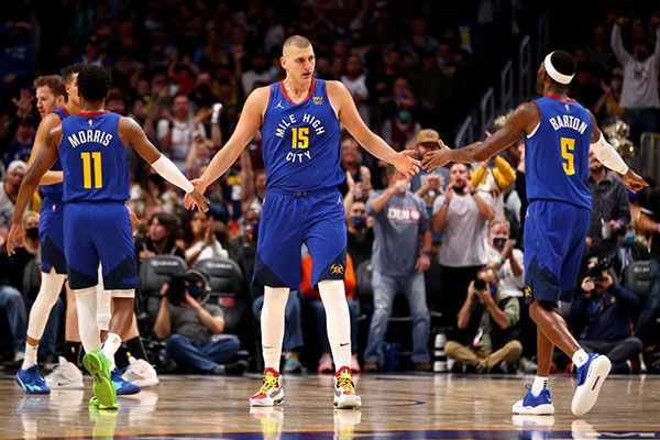
1. NUGGETS CITY-MIXTAPE EDITION
(Photo by Matthew Stockman/Getty Images)
This design shouldn’t work.
But it does.
The challenge of this uniform design was clear: Find a way to incorporate all eras of Nuggets history into one uniform — from the ABA years to the modern day.
Most mash-ups like this — whether you’re talking about a uniform or anything else — fail. The Nuggets’ City Connect uniform offers a wondrous exception to the rule.
It squeezes together everything from the “Denver” wordmark that dates back to the 1970s to diamond and triangle patterns of the ABA days to the navy blue of the mid-1990s and today to the baby-blue era of George Karl and Carmelo Anthony.
It’s like gumbo. A bunch of disparate ingredients that comes together into a delight for the senses.
When wearing this uniform, Nuggets players are a running, living tribute to everyone who came before them to define Mile High City basketball.
Another lesson for Nuggets design: (Almost) anything rainbow is good.
The rainbow is the signature design element of Nuggets history. Everything else but Maxi Miner is ultimately forgettable to all but the hardiest of die-hards.
It’s like the San Diego Padres returning to brown as a primary color. For nearly three decades, they attempted to make navy blue happen. They tried it with orange, with “sand” beige uniforms and with nothing else at all. Eventually, the Padres stopped wandering through the sartorial desert, embracing their unique visual identity.
The Nuggets need to lean into the rainbow. It’s what they are.
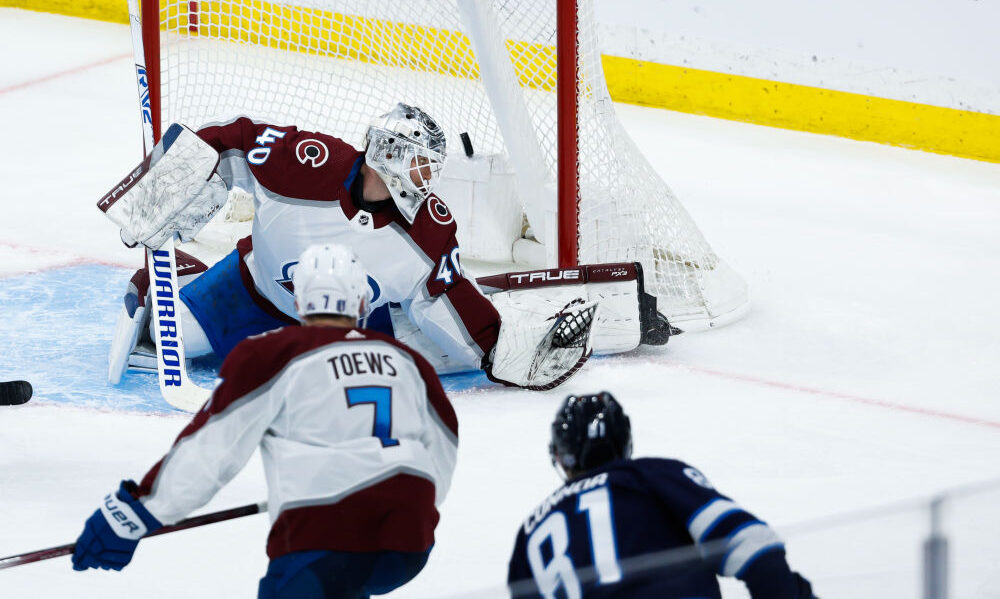
2. AVALANCHE NAVY BLUE
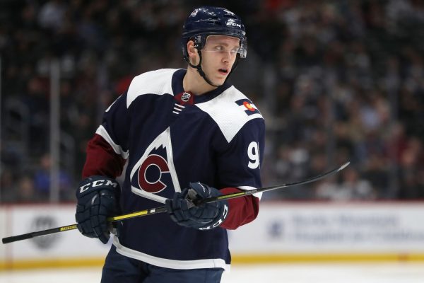
(Photo by Matthew Stockman/Getty Images)
There is an argument to be made for this being the Avalanche’s primary sweater. The A-with-puck is fine, but bellows mid-1990s. This nods to Colorado’s NHL history with a logo that slightly evokes the 1976-82 “Rocky Hockey” days, but puts an Avalanche twist on it. Navy blue and burgundy is a handsome color combination.
And you can’t go wrong with state pride — especially when your team name has “Colorado” in it. Count me among those who can’t get enough of the Colorado state flag, especially when it flows so seamlessly as a shoulder patch.
Further, the Avalanche keeps the vertical arching used for player names on the backs of the jerseys. This looks gorgeous on every hockey uniform that uses it. It’s part of what ties the Avalanche and Red Wings together.
Vertical arching requires more work for the equipment staff, as each letter must be individually cut and placed. You can’t just go grab the letters for “Landeskog” from a stack of Ls, As, Ks, Gs, etc. and sew them on. But the extra effort is worth it.
The Avs have a solid set of uniforms, but this is their apex.
3. ROCKIES PURPLE JERSEYS
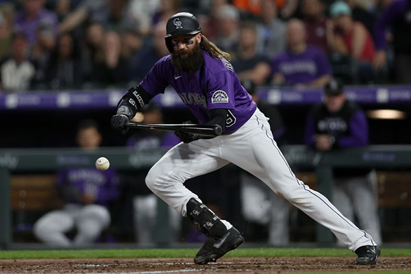
(Photo by Matthew Stockman/Getty Images)
Just as the rainbow is the Nuggets, purple is the Rockies. No other Major League Baseball club has purple as a primary color. This leans into the Rockies’ identity.
Further props to the Rockies for having a specific set of home pants to wear with this jersey — the pinstripes wouldn’t work with it, but the white britches with a single purple stripe down each leg are a handsome complement.
However, this jersey might look a bit better with gray piping on the sleeves, around the collar and down the front of the jersey, in the same style as the purple piping on the gray jersey. That would take this look up a notch.
This is the style of Rockies jersey I own, and it’s always fun to wear.
Although I must tip my cap to my wife; she chose the Charlie Blackmon jersey and he’s still here; I chose the Nolan Arenado jersey, and Brandon Stokley would like to see that shirt in a fire pit.
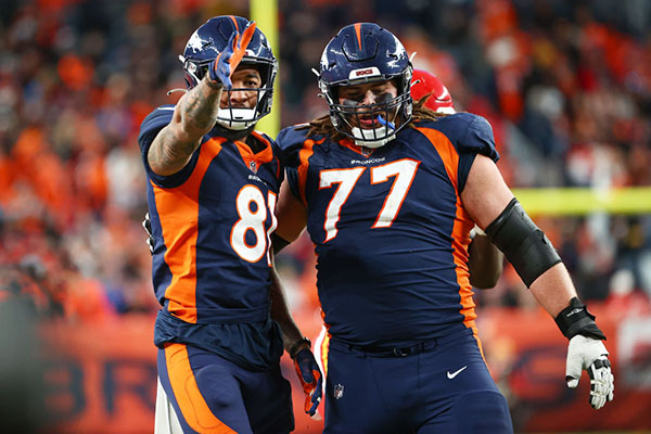
4. BRONCOS COLOR RUSH
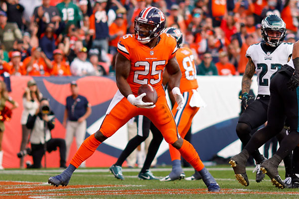
(Photo by Justin Edmonds/Getty Images)
If we were ranking jerseys alone, this would be No. 1.
One can quibble with the use of the current navy blue instead of the classic light-royal-blue, but from a design perspective, the Broncos didn’t have a choice. The NFL’s one-helmet-shell rule — which ends this year — prevented the Broncos from making this a true throwback uniform.
Further, the “Color Rush” concept forced the Broncos to use orange trousers. Orange is at the core of the Broncos’ identity, but with the orange jerseys, it’s too much of a good thing. From a distance, the players look like ambulatory pylons scurrying about the field.
So, like a resourceful chef, they did the best with the ingredients they had.
The result is a uniform that still scores high despite the monochromatic look because of other elements.
The blue-white-blue stripe scheme on the jerseys and pants is timeless. So is the block-number font. You never have to worry about this template being dated.
Also, the stripes are consistent. A failure of the Broncos’ current regular-uniform template is that the helmet stripes — three triangles — don’t match the side-panel swooshes on the sides of the jerseys and pants.
Finally, this uniform brought back the classic “D” logo. The number of Broncos players who sport gear with that logo is testament to the enduring popularity and retro-chic of that quirky level. Yes, the horse’s legs are skinny. Yes, the demonstration of breath on a cold day is awkward. It doesn’t matter. It’s a throwback to a more organic, livelier logo age when logos were designed with pen and paper, rather than on Adobe Illustrator.
If the Broncos want to do a full uniform redesign with little fuss and no focus groups, they could take this template and apply it to jerseys in orange, white and blue, with pants in the same colors. Just try to stay away from orange-on-orange.
5. ROCKIES CITY CONNECT
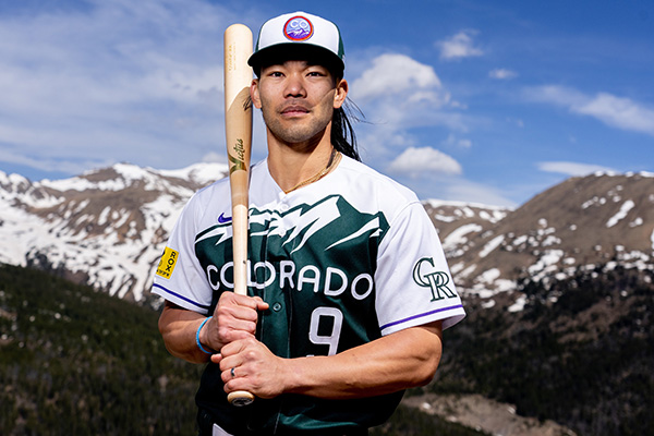
(Courtesy: Colorado Rockies)
This is one-third of a great uniform.
The jerseys: A triple to the gap in which you hit third base standing up.
The caps: A check-swing nubber that might get you to first, but might not. It depends on other factors, like how quickly the catcher escapes his crouch and throws to first — or how quick you are sprinting from the batter’s box.
The pants: A swing and a miss.
In detail:
I can’t like the jerseys enough. Colorado has long had one of the nation’s finest and most iconic license plates — whether the mountains are white or green. The font with Art Deco elements has been used in some capacity since 1945.
The only improvement would have been to have the players’ names on the backs of the jerseys in this font. That’s a missed opportunity that could have been accomplished with just a little more design effort. You’ve come this far; don’t stay put at third when the fly ball is deep enough to score you.
Up top, the cap has a great base idea; contrasting-color front panels usually work well. However, the execution is dicey. The cap insignia, it just doesn’t go with the uniform. I like the concept — homage to the types of stickers that one buys in vacation spots and slaps on suitcases and laptops.
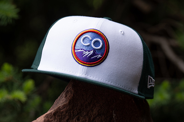
(Courtesy: Colorado Rockies)
But it could have been done in colors that flow with the rest of the uniform. Have the mountains in green and the sky in white (flowing with the jersey design), and have “CO” in purple or green, then have the border of the circle and purple and green. Done. Now, you have a cap logo that meshes with the rest of the uniform.
This logo — with purple, blue, yellow and red — is a great concept that belongs on another uniform. Perhaps the next Rockies “City Connect” design could lean into the “Colorful Colorado” motif and use an entire spectrum of hues, rather than green, white and purple trim. On that type of uniform, this cap logo would sizzle.
As for the green trousers with the white belt, it looks like someone robbed the pro shop at Bushwood Country Club, circa 1980. Woof.
6. NUGGETS “MILE HIGH CITY” SIGNATURE EDITION
(Photo by Jamie Schwaberow/Getty Images)
This uniform is fine. And because of that, I find myself thinking of Roy Kent’s soliloquy from “Ted Lasso” on being “fine”:
“He’s fine. That’s it. Nothing wrong with that, most people are fine. But it’s not about him … Don’t you dare settle for ‘fine,'” he says.
If the Nuggets had a history of pedestrian uniforms, I’d think more of the “Mile High City” look.
But compared to some other Nuggets’ other alternate designs over the years, it’s blasé. When you have the rainbow-Tetris look in your closet, the “Mile High City” design leaves you saying, “Meh.”
It’s OK. It doesn’t burn the retinas. It’s also as forgettable as a Tuesday-night game in January against the Orlando Magic. But why be “fine” when you have “fire” in your portfolio?
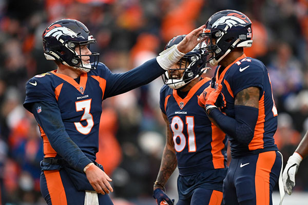
7. BRONCOS ALL-BLUE
(Photo by Jamie Schwaberow/Getty Images)
Some people love ’em; others despise ’em. Count me in the second category.
The Broncos wore the blue britches once in the 1997 preseason, then stashed the blue pants in the back of the closet for six years before returning them to the ensemble in 2003. They should have stayed there.
With the exception of all-white and all-black, the opinion here is that monochromatic uniforms don’t belong in the NFL. They look lower-tier. Fine for high school, colleges and whatever minor league happens to pop up this year. Not for the NFL.
The linemen are too bulky and the cut of the uniforms is too tight. In the case of the Broncos’ blue-on-blue look, the players look like blueberries with orange parentheses on the side.
Nothing about this is palatable. The entire scheme screams late-1990s and early-2000s. That is part of why one of the first tasks for the new ownership group should be to refresh the brand with a design that is timeless and sleek, rather than clunky and obtrusive.
(Photo by Dustin Bradford/Getty Images)
(Another thing that happens is the jerseys and pants don’t always align straight and players wear undershirts that peek out from beneath the shirt tail. Thus, the intended unifying effect between the jersey and pants of the side-panel swooshes comes out disjointed.)
The Broncos are the sartorial outlier in a division of clean, sharp uniforms. What Vic Fangio said about the quarterbacks the day before he was fired — that the other AFC West teams have “top-shelf” passers — also applies to the uniforms. This makes Denver is a distant fourth.
The blue-on-white uniform that the Broncos wore as their primary home look from 1997 through 2011 and again for occasional games since then remains the best use of blue. (It would still rank 7th on this list.) However, it would look better in the Color Rush stripes-and-number-font template.
This ranking is more a comment on the Broncos’ overall template, which is like fruit left on the counter too long.
8. COLORADO RAPIDS “PRIMEBLUE”
🌊 For the oceans. For the planet. 🌎
Our 2022 Primeblue jersey, made with Parley Ocean Plastic is here! @adidasfootball x #Rapids96
— Colorado Rapids (@ColoradoRapids) May 26, 2022
There is a league-wide purpose to the “Primeblue” jerseys worn this weekend. Parley Ocean plastic comprises 50 percent of the jersey material, with other recycled materials also making up the fabric. The goal is to raise awareness and spur action regarding the impact of plastic waste that winds up in the world’s seas and oceans.
I like the idea.
So, why is it last?
Because the execution is lazy — and it’s not really the Rapids’ fault.
Every team in Major League Soccer will roll out these uniforms over the weekend — one side wearing blue, the other wearing white. (The Rapids get blue for their home clash with Nashville SC.) It is a league-wide initiative. Why not let the clubs have an individual go at this?
All the matches will look the same this weekend. Good luck differentiating between games, MLS channel surfers.
***